Our illustration style is an important aspect of our identity. Adhere to the guidelines below when creating new illustrations to ensure we are maintaining consistency in our style over time.
-
Illustration Guidelines
- Composition: Illustrations are fully vector. Objects are presented in a simplified representation. Shapes are intentionally drawn imperfectly.
- Color: We use the Extended Palette colors to create our illustrations. The colors were specifically chosen to work harmoniously together in illustrative contexts, so use them creatively!
- Patterns: We can use our geometric pattern over portions of illustrations to create contrast and depth. Be careful not to overdo it; too many patterned elements will clutter the design and look bad. You should typically use the pattern in one color level higher or lower than the background color, however, your specific use case may require another pattern value.
- Texture: The finishing touch on our illustrations is the subtle texture overlay. See below for more details on using the texture.
-
Download Services Illustrations
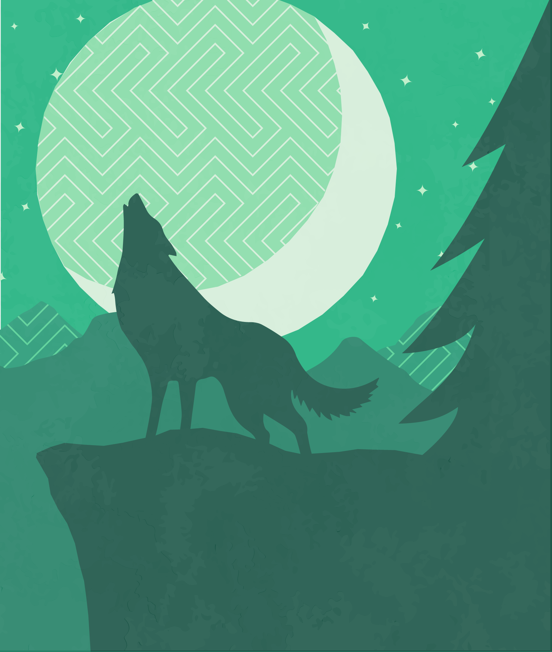
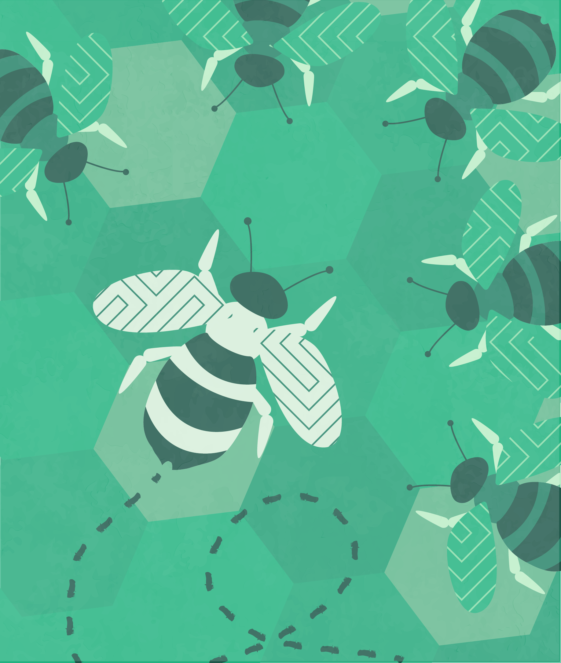
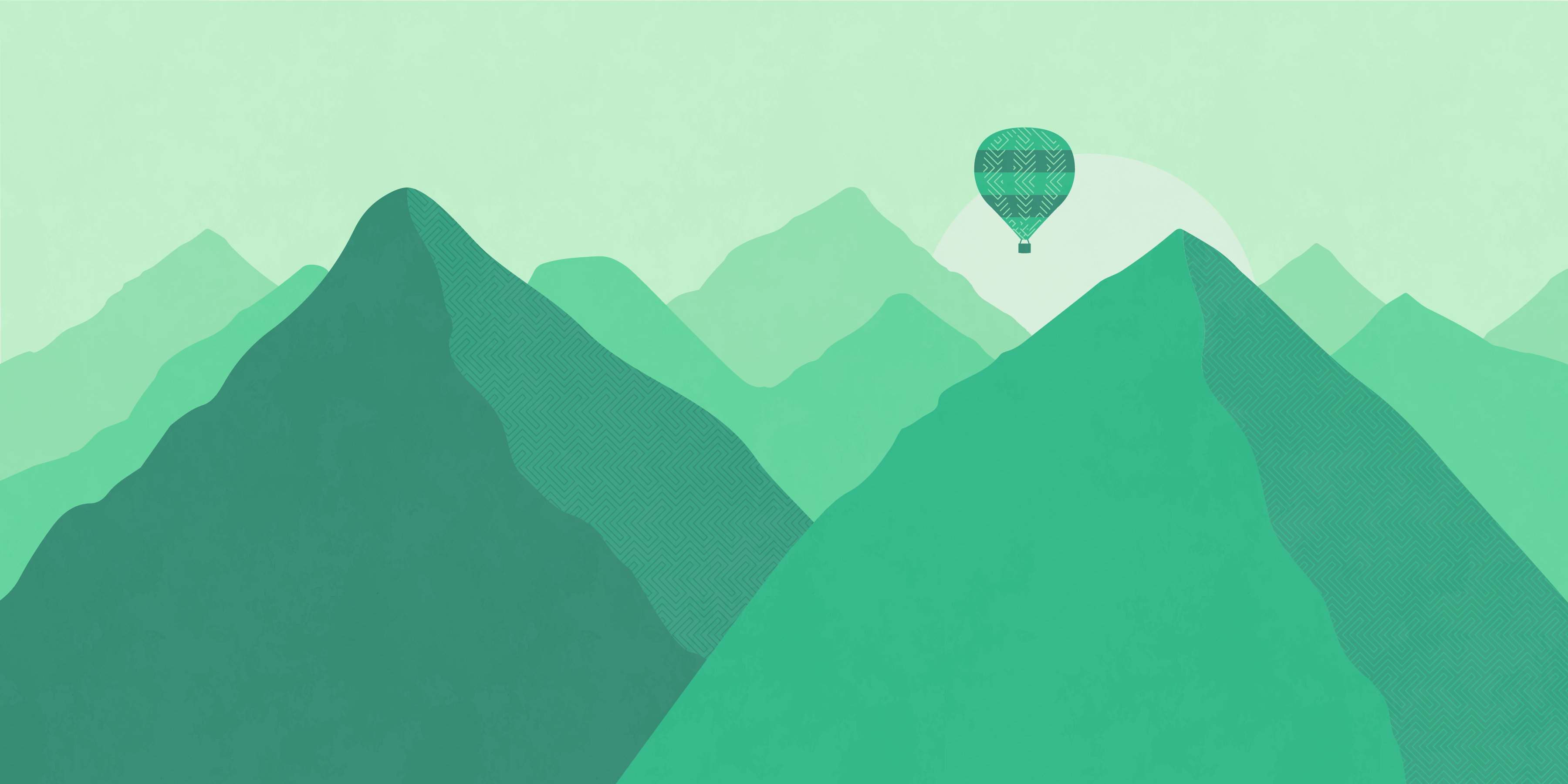
Scene Illustrations
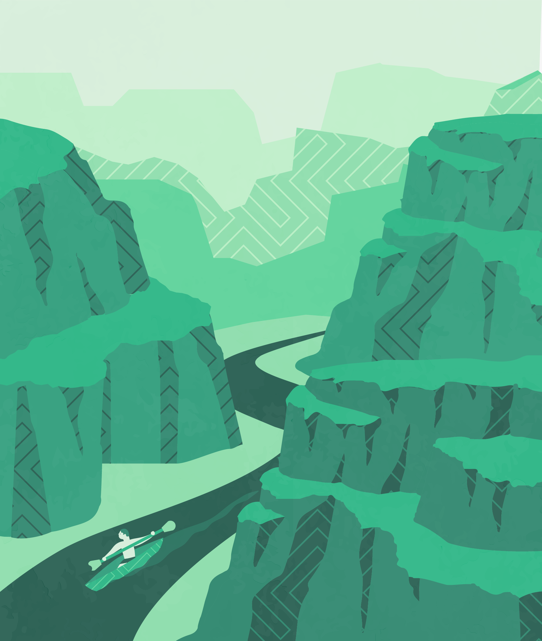
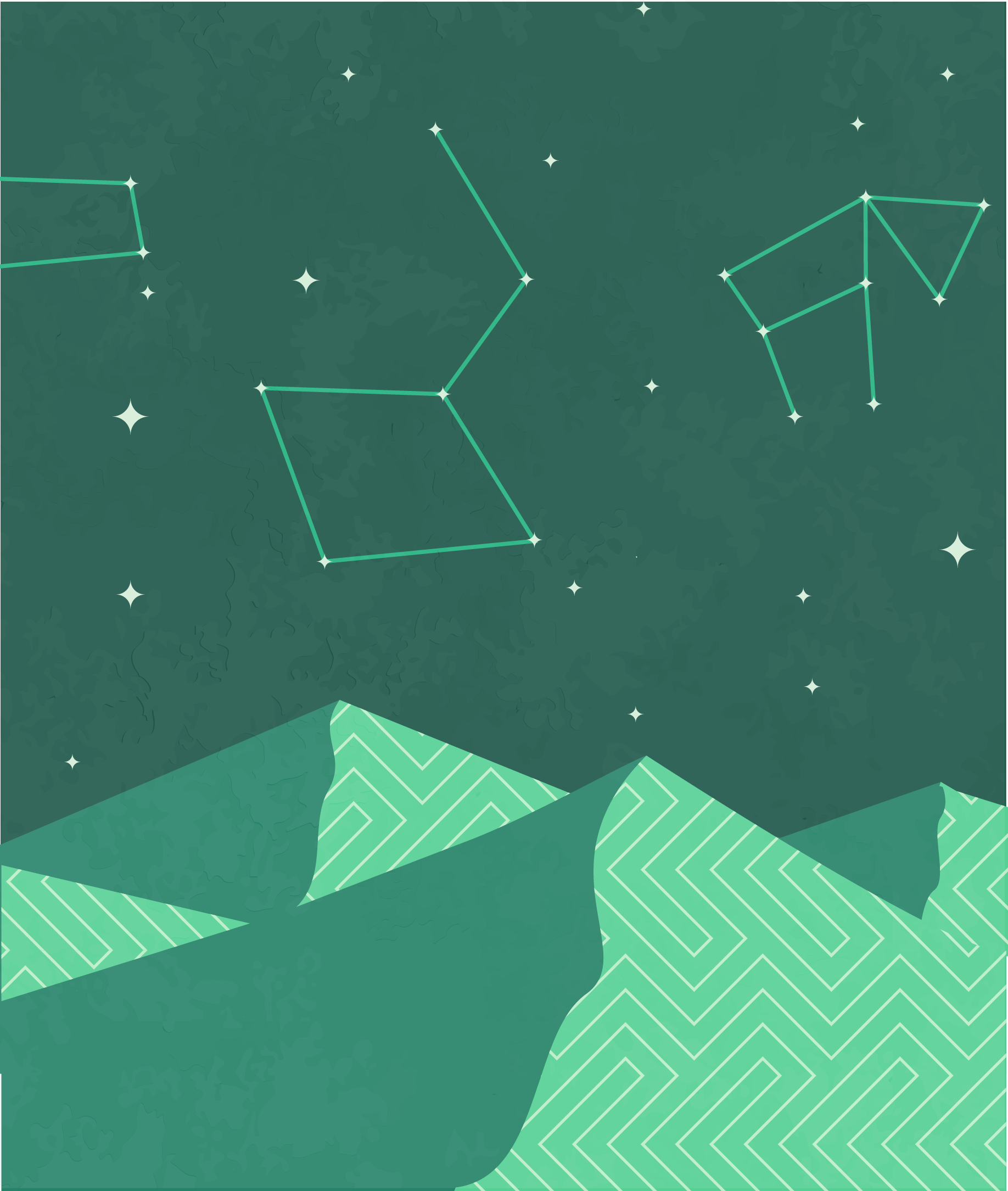
Scene illustrations fill up a full rectangle and depict some kind of scene, whether that's a wide landscape view or a close up. These illustrations are usually visual metaphors, communicating a business idea through a natural occurence. Our services are illustrated as scenes.


-
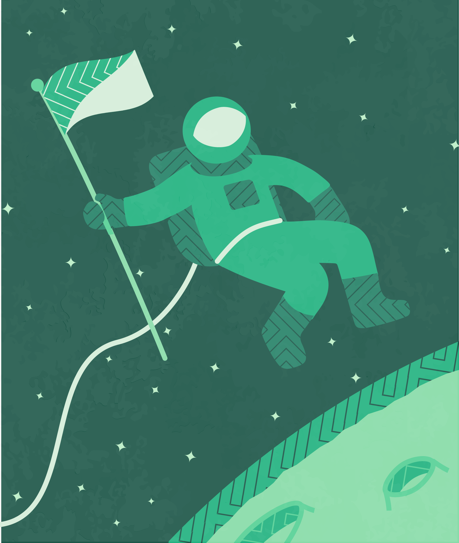
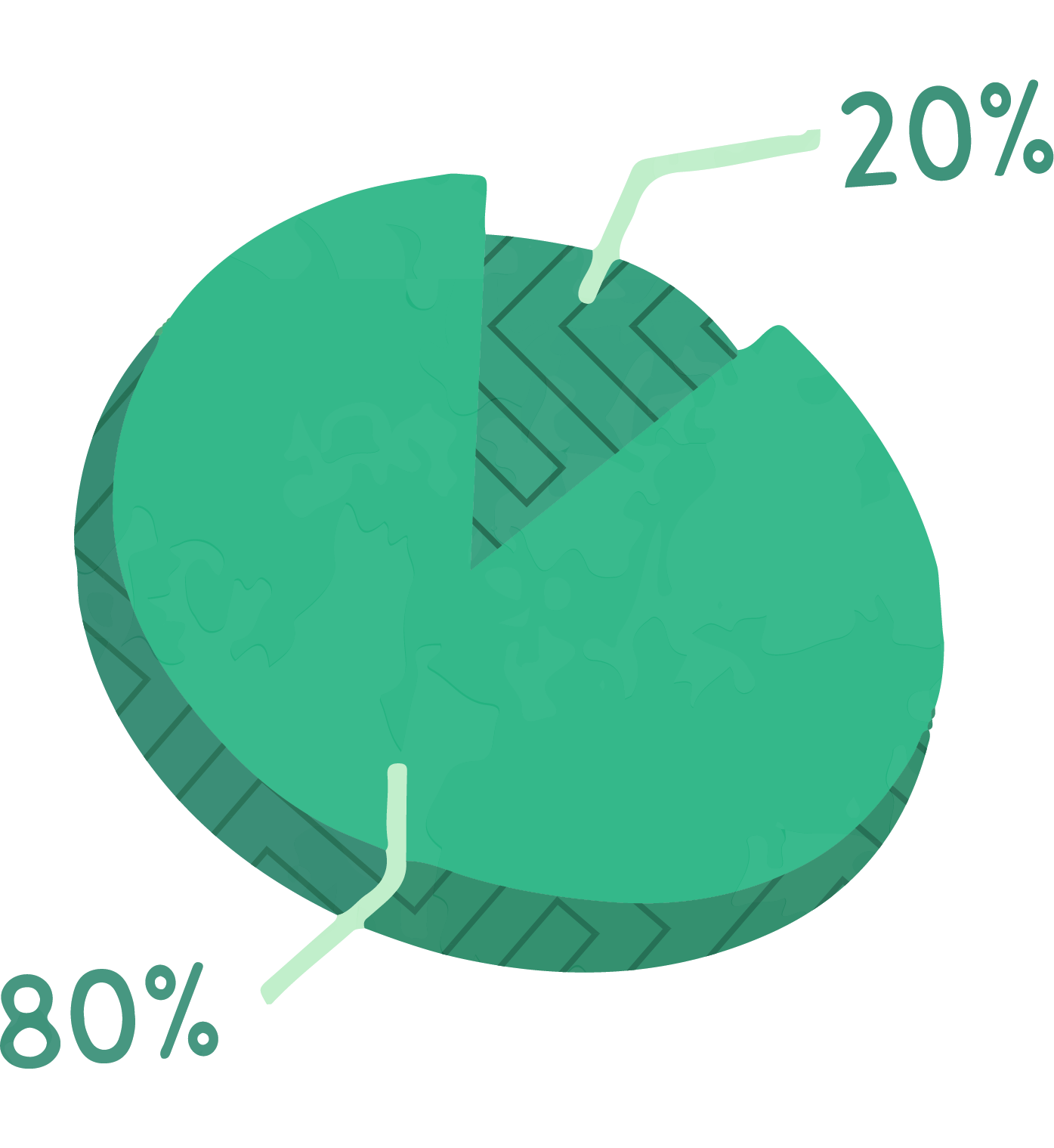
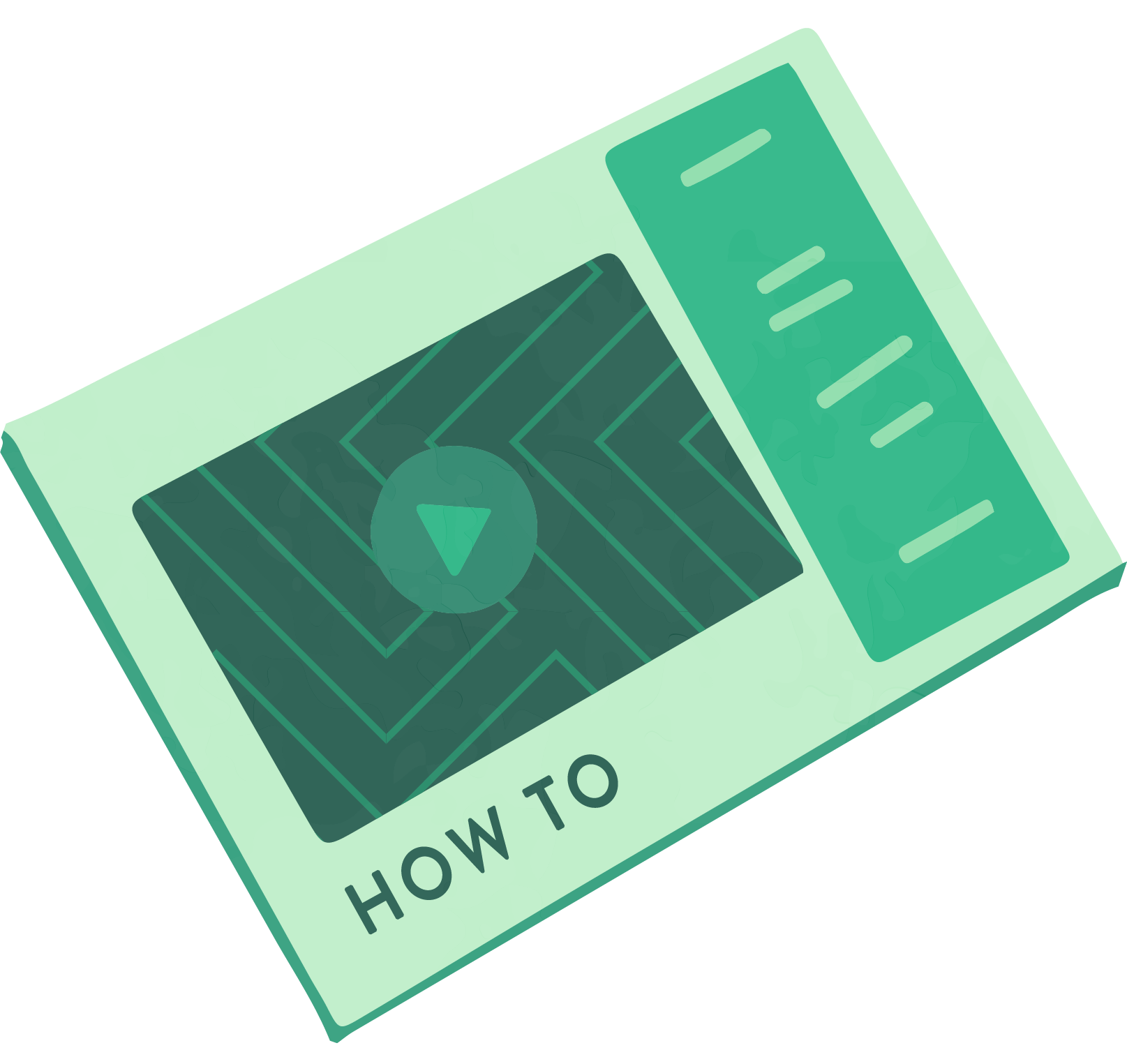
Spot Illustrations
Spot illustrations are useful to depict objects that stand on their own without a background. We commonly use these types of illustrations in our E-books and social media graphics. The amount of detail in each illustration will depend on how large the illustration will appear in the composition, i.e. a spot illustration that serves as an icon in a chart will have less detail than one featured on the cover of an E-book.


-
Texture Overlay
The tileable shape should be added on top of the whole illustration with the below settings applied. In spot illustrations, you should only apply the overlay on top of the shapes, rather than the whole space.
Download TextureSetting Value Opacity .15 Mix Blend Mode Hard Light